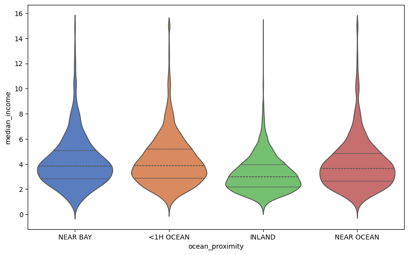
Exploratory data analysis (EDA) on complex datasets requires tools that reveal deep, hidden patterns, including overlapping distributions and outliers. Open-source Python data visualization libraries like Seaborn can surface such patterns when used effectively, helping you perform high-quality statistical analysis.
This article shows three lesser-known plot types that reveal aspects like correlation, density, and distribution:
- Joint plot
- Pair plot
- Violin plot
1. Joint Plot: Revealing Patterns in Bivariate Relationships
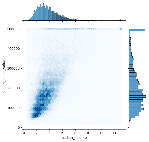
Simply put, a joint plot resembles the combination of a bivariate plot — like scatterplots or similar — and two univariate histograms, all over two selected continuous data variables.
It shows the correlation between the two variables alongside each variable’s distribution. The real added value of joint plots is the option to use hex bins, which help reveal regions of highly concentrated data. Meanwhile, the two marginal histograms easily expose hidden skewness that correlation metrics typically ignore, or even artificially capped points. In the example below, a cluster of points is clearly capped on the median_house_value variable (describing house pricing):
import pandas as pd
import seaborn as sns
import matplotlib.pyplot as plt

# Loading open California Housing dataset
df_housing = pd.read_csv("https://raw.githubusercontent.com/gakudo-ai/open-datasets/main/housing.csv")

# Plotting hexagonal colored bins for density and marginal histograms for distribution
sns.jointplot(data=df_housing, x='median_income', y='median_house_value', kind='hex', cmap='Blues')
plt.show()
2. Pair Plot: Multidimensional Cluster Discovery
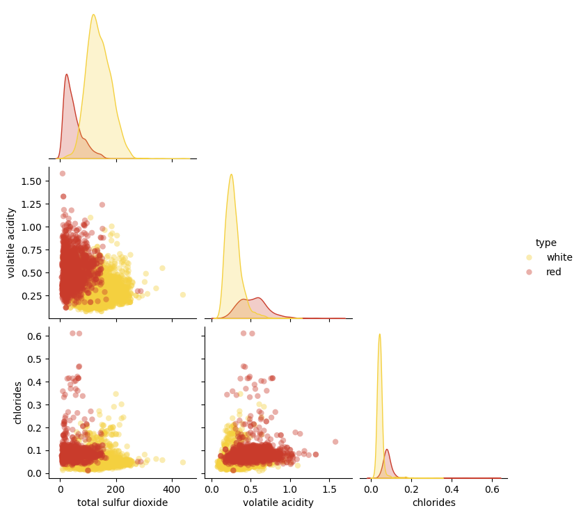
This plot builds a grid displaying each numerical variable in a dataset against the others. The diagonal of the grid shows smooth distributions via kernel density estimate (KDE) curves, while the off-diagonal cells display pairwise scatterplots. The real power comes from applying a categorical hue to differentiate data points belonging to different categories or classes.
import pandas as pd
import seaborn as sns
import matplotlib.pyplot as plt

# Load open Wine Quality dataset
df_wine = pd.read_csv("https://raw.githubusercontent.com/gakudo-ai/open-datasets/main/wine-quality-white-and-red.csv")

# Select features that represent different chemical processes in red vs. white wine
features = ['total sulfur dioxide', 'volatile acidity', 'chlorides', 'type']
df_subset = df_wine[features].dropna()

# Plot pairwise relationships
sns.pairplot(
    df_subset,
    hue='type',
    corner=True,
    palette={'red': '#C93B2B', 'white': '#F4D03F'}, # Appropriate colors
    plot_kws={'alpha': 0.4, 'edgecolor': 'none'}
)
plt.show()
As we can observe, some of the variables selected for the pair plot help discover specific patterns and nuances — namely regarding chemical properties like volatile acidity and sulfur dioxide — that behave differently in red and white wines.
3. Violin Plot: Bimodal Distributions Unmasked
Violin plots are essentially a box plot embedded inside a KDE curve. They show medians and quartiles like a standard boxplot, but also expose the full density and shape of your data across distinct categories.
Violin plots can reveal whether any variable in your data exhibits a bimodal distribution — meaning data within a specific category has two distinct sub-populations rather than spreading evenly.
import pandas as pd
import seaborn as sns
import matplotlib.pyplot as plt

# Filtering for clarity ('ISLAND' category is omitted because of being infrequent)
df_housing = pd.read_csv("https://raw.githubusercontent.com/gakudo-ai/open-datasets/main/housing.csv")
df_filtered = df_housing[df_housing['ocean_proximity'] != 'ISLAND']

# Plotting distribution shape by category
plt.figure(figsize=(10, 6))
sns.violinplot(data=df_filtered, x='ocean_proximity', y='median_income', palette='muted', inner='quartile')
plt.show()
In the plot below, the thick sections of each “violin” show where the majority of the population’s income is concentrated for each category. Long tails indicate potential outliers pulling averages up or down.